Thursday, February 25, 2010

Meeting Summarization

Paper: Improving Meeting Summarization by Focusing on User Needs: A Task-Oriented Evaluation

Written by: Pei-Yun Hsueh and Johanna D. Moore

Comments: Brandon

Summary:
This paper conducted a study on recorded meetings and how fast they could extract the decisions made in the meetings. The goal was to make a good meeting browser so that people could see summaries of the meeting and figure out the decisions that were made in each meeting. There were 35 participants where 20 of them were female and 15 were male. They filled out a questionnaire about their prior experience with computer usage and meetings, and then they had to analyze four meetings and summarize what decisions were made in the meetings. They had to write a brief summary of the decisions in 45 minutes using the browser interface. The meeting browser had audio capability so that every participant could listen to the meeting or select portions to listen to. The browser also had four different summary displays.
  1. Baseline (AE-ASR): automatic general purpose extracts with automatic speech recognition
  2. AD-ASR: automatic decision focused extracts with automatic speech recognition
  3. AD-REF: automatic decision-focused extracts with manual transcription
  4. Topline (MD-REF): manual decision focused extracts with manual transcription
The graph above are the results from the analysis of the summaries that each participant created from the different browser options. It shows that on average the participants that were given the decision-focused extractive summaries were able to hit each decision point much better than the general purpose one. They again tested this to see why there was a difference with an analysis of variance. The decision-focused displays seemed much easier to use to the participants and they thought it was less demanding as well.

Having the display option for the user was beneficial to all participants in achieving their task. It was much easier for the participants to go through the decision summaries in order to figure out the decision points then it was to go through the extractive summaries that were usually rather long. Only a few participants actually went through the audio-video recordings that were made available in order to find a few more of the decisions. The conclusion that the paper came to was that they couldn't conclude how efficient their browser was since the baseline decisions were still of high quality. The topline decision-focused participants were able to go through the task much quicker, but since all participants concluded around the same decisions they could not pinpoint the efficiency of the browser. Even when the users encountered 30-40% inconsistency with the data from the actual meeting being translated into the extracted summary they were still able to come up with what the decisions were. So basically their browser worked well for either scenario, but they couldn't tell us how efficient it was.

Discussion:
This paper was semi-interesting and more just confusing. For some people it may be nice to have this to look back on a few things they were uncertain of or allow people that could not make the meeting see what the meeting was about, but I think that with the way businesses are being run that anyone could attend a meeting from wherever they were and this wouldn't be an issue. I think this browser could be improved and made more useful for a business to use if they found a way to highlight the decision points without someone having to go through the meeting and picking the decisions that were made. I wish I understood their methods a little bit better though and hopefully after I read it again for the presentation I can talk more about it.

IW - Intelligent Wheelchair

Paper: Intelligent Wheelchair (IW) Interface using Face and Mouth recognition

Written by: Jin Sun Ju, Yunhee Shin, and Eun Yi Kim

Comments: Ross

Summary:
This paper proposed the idea of an intelligent wheelchair that would recognize face and mouth controls from a severely disabled person in order to navigate the wheelchair. The direction that the IW would go would depend on where the users face was inclined, and the starting/stopping of the IW would depend on the users' mouth. There are also 10 range sensors used for the wheelchair so that it can avoid obstacles in whatever environment it is in. The wheelchair has an embedded computer and sensors that allow the user to control the movement of the chair. The system is also able to figure out intentional behavior (looking to the right to move the chair) versus unintentional behavior (looking at something that could be a potential obstacle).

This system recognizes a users movements and converts it into something that the chair can understand so that it can move accordingly. There are three steps in this process:
  1. Detector
  2. Recognizer
  3. Converter
Once the facial recognition is in place, it is then time to figure out what the mouth is doing. The way the mouth is detected is based on two properties:
  1. The mouth is located in the lower region of the face
  2. The mouth has high contrast when compared with its' surroundings
There are a few mouth 'templates' that are taken to begin the recognition of what the mouth is doing (telling the chair to go or stop). K-means clustering is used to figure this out, and then the Hamming distance is used to figure out what mouth template will correspond to a given candidate that is using the chair.

The converter portion is used in order to give a certain amount of power to the machine based on the users input that the compute is reading off. The board program will control the speed by regulating the amount of voltage that the chair will receive.


The authors wanted to test their solution against solutions that have already been created. They tested it against the joystick wheelchairs that most people are used to seeing, and they also compared it to the headband method of moving a chair which is a little bit similar to their solution. Their first experiment dealt with the commands while the second experiment compared their method with the other two methods. They used a range of people in order to test this which is shown below.


Their results showed that their system could accurately detect the face and mouth of each user, and also figure out how their head was inclined so that the IW could move in that direction. The calculated how long each action would take and also compared that to the other methods. They used recall and precision in order to show their methods performance.

They came to the conclusion that the joystick method was the fastest because it more comfortable for people to use because they did not really want to use their face to move the chair. After training the individuals on how to use their face it became evident that their method was more accurate.

Discussion:
I think this paper was very interesting and it would be really nice to have for those people who are severely disabled and are unable to use the joystick wheelchairs. There has been some future work already being planned for this wheelchair such as adding more sensors to accurately detect obstacles to avoid injury to the user of the chair. I think that is a great idea because there are multiple things that could be seen as an obstacle to a wheelchair and it is necessary for this chair to help the user avoid them. They also want to make sure that IW can better detect situations so that when a user is talking to someone the IW won't start moving around on them. This would definitely be something useful for people and I hope that they can improve on it so that people are more comfortable with using it.

Thursday, February 18, 2010

IKEA Hacking

Paper: Learning from IKEA Hacking: "I'm Not One to Decoupage a Tabletop and Call It a Day."

Written by: Deniela Rosner and Jonathan Bean

Comments: Jill

Summary:
This paper deals with multiple people taking IKEA furniture and turning it into their own creations. Each person enjoys the design process and really gets satisfaction from it. One user said that they really personalize everything because it was a reflection of themselves in their work. One person modified a chair, and another modified cabinets to go into their kitchen where they wanted them.


Many people hack items for their home use, and this touch based on how people go about doing it. There are now websites that explain how to hack certain IKEA items and a community for people who like to express themselves with this type of creativity. The community allows them to connect with other people who are like them so that they can share their creativity with people who will truly appreciate it.

Discussion:
I thought this was extremely interesting because I've put together IKEA furniture before and not once have I not followed the directions. It would be cool to see what kind of things that a person can make with certain IKEA furniture. I'm glad that they tried to differentiate between code/software hacking and the "hacking" of other items. I'm not sure these can really be compared, but at least they made the effort to differentiate them.

Social Computing - Privacy

Article Title: Social Computing Privacy Concerns: Antecedents & Effects

Written by: Oded Nov and Sunil Wattal

Comments: Eric

Summary:
This paper focused on privacy in a social network setting and how much information a person would share about themselves in certain social communities. Privacy concerns are not yet clear when it comes to social communities, and this paper researches two questions:
  1. Antecedents of privacy concerns: "Do social norms contribute to individual's privacy concerns in online communities? Does trust in other network participants affect users' privacy concerns?"
  2. Impact of privacy concerns: "Do higher levels of privacy concerns in an online community lead to lower levels of information sharing? What role does the position of the user within the network structure play in a user's willingness to share?"
The way they researched these questions was studying the way photos are shared on Flickr. There were 1270 people invited to do a web survey, and they only received 192 valid responses. Below is a picture of the sample questions asked in the survey.

This paper concluded that when people are concerned with privacy then they will not share as much information, but when it comes to a site like Flickr and other social computer sites they are more likely to share more information because they are familiar with the other users.


Discussion:
For this paper I thought the results would be similar to what they were. Things like Facebook where you know the people you are adding as friends, and the fact that you can control your privacy settings makes it easier for someone to share more information. If it's a new site that they aren't used to then they will probably share less. For photos on the other hand I would have thought people would share less or not allow their personal photos to be shown to the public community, but I guess it has the same effect as Facebook would. I think that for the future work it would be beneficial to get a wider range of participants, or just a larger number of them than this paper had. It may give a better idea as to who is willing to share information and tell why.

Monday, February 15, 2010

Running the Asylum - first 7 chapters

Book: The Inmates are Running the Asylum
Author: Alan Cooper


Comments: Jill, Aaron

Summary:
In the first 7 chapters Alan Cooper is trying to show that interaction design makes people frustrated, and that it needs to be changed in order to make it more "user friendly". Many users feel stupid when they can't control their computers, and the way Alan Cooper says it "programmers don't think about the user" and think that most things are user error. I wasn't really sure what to think of this book, but there were a few things that he mentioned that did make sense.
  • Things you combine with a computer end up just being a computer. It doesn't necessarily make anything easier to use, and in fact it usually makes the item harder to use than it was originally intended.
  • Cognitive Friction: "the resistance encountered by human intellect when it engages with a complex system of rules that change as the problem changes" (19).
  • Wasting Money: money is wasted when programs have a deadline and the programmers don't have enough time to implement and add functions that are necessary for a good product. Being late with a product isn't as bad as developing something that doesn't work that well. Money is wasted this way though, and all the management wants is more features and a program that they think will sell.
  • The Dancing Bear: features that seem to work well, and people are unaware that the feature could actually be much better than it is.
  • Customer Disloyalty: because programs are being produced that aren't to their full potential, companies are losing clients and they aren't buying their products anymore.

Discussion:
I think Cooper is trying to show that programmers should not also be in charge of the design, and if design would go first then the programming would be better. This would save money, and produce better features that weren't just "dancing bears". I felt as though he was picking on programmers, especially in chapter 7 when he compares programmers to jocks. But that scenario can be rather true when really thought about. I believe that if the design was implemented first, then programming would be better and the programmers would actually be able to shine more by making the functions actually work. Since the world is so demanding time limits and constraints are what makes some interaction design become much more frustrating to the user than it was intended. Some things should really not be released until they are fully functional and truly "user friendly".

Tuesday, February 9, 2010

Design of Haptic Interfaces for Therapy

Written by: Cati Vaucelle, Leonardo Bonanni and Hiroshi Ishii

Comments: Zach
Summary:
This paper deals with devices that may be able to be used for therapeutic purposes. Therapeutic holding has been something that has worked for a few disorders because it feels like hugging. One case would be an autism child wearing a heavy blanket to stop them from having panic attacks. They came up with four different prototypes.

  1. "Touch Me": a flexible motor array in a soft enclosure that would be used to touch certain parts of the body for therapeutic purposes.
  2. "Squeeze Me": would be use to promote human contact with patients who would get to overwhelmed if having to deal with a real person. The hugging-like sensation could keep them from having panic attacks, or other issues that they deal with with their disorders. It could also be worn outside of a clinic area without people taking notice to it because the pressure bladders go inward towards the body and should not be noticeable under a shirt.
  3. "Hurt Me": this would be used for those patients that usually mutilate themselves when dealing with a disorder that they have. This would give them the pain sensation that they need without actually hurting them self. This would also give a closer relationship between therapist and patient so the therapist realizes the pain their patients feel and need to be ok.
  4. "Cool Me Down": has a temperature all the way around the wrap that will help patients self-administer a cooling sensation for sensory grounding.


These prototypes were presented to a few therapists and they gave their approval that these devices would be good to test on patients as long as there were safety measures being met. The "cool me down" may not be able to be very portable due to the motor needed to run it, but the others would be able to. They also thought "Hurt Me" would need a new name in order to be used. Now they just need to actually test these prototypes on patients in order to see if they actually work as intended.

Discussion:
I think this is a great idea, especially the "Hurt Me" so people will not mutilate their bodies in order to feel the pain they need with their disorder. If these therapeutic prototypes will work for certain people with disorders to keep them from having panic attacks or violent tendencies then I think this is something we should begin working on. Future work would obviously be actually testing these things on patients and recording whether or not it actually worked for them. It's something to really think about and hopefully be able to produce so people with disorders can qualm their needs without harming themselves or others.

It's a GrayArea...

Paper: It's Not That Important: Demoting Personal Information of Low Subjective Importance using GrayArea

Written by: Ofer Bergman, Simon Tucker, Ruth Beyth-Marom, Edward Cutrell, and Steve Whittaker

Comments: Randy

Summary:
Everyone who owns a computer has to deal with organizing their data so that they can find it whenever they need it. For some users it is hard to decide whether or not to delete an item, or keep it because it may be used again. GrayArea is something that will allow people to demote files that they can't decide if they will need again or not into a gray area that is part of the explorer. When searching for something on their computer users may feel guilty for being "unorganized" and it will distract them from opening the file they had originally went to look for. This group of people created three different designs that they asked for feedback before creating a prototype.
  1. Chronological Sorting: listing documents from recently viewed instead of the Microsoft way of viewing by recently changed. This way documents that have not been open in a very long time would be on the bottom, and the ones viewed/used a lot would be on the very top.
  2. FadedItems: would give the user an ability to fade out the files that they thought were not very important. The more important ones would remain completely visible. (Fade and Unfade options)
  3. GrayArea: allow users to drag files and folders into a designated gray area so that they would not have to make the decision to delete them for good.

There were a few things that they had to consider when creating a prototype.
  • Direct or Auto manipulation: should the user be able to determine what files and folders to manipulate (fadeditems and grayarea), or should the computer do that for them (chronological ordering)
  • Designated or Undesignated location: should they remain in the same folder and place, or should they be moved somewhere else where they will be less of a distraction.
  • Continuous or Categorical demoting
There were 79 participants that were polled on what they thought would be a design that they would use. They answered questions and responded with an answer from 1-5 on whether they liked the idea or not. The results are listed below.

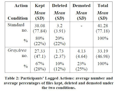
They considered these results and the reasons behind why people chose what they did. For Chronological Sorting most people didn't even use the chronological sorting already implemented in the operating system, so why edit it if people haven't used it and probably won't. For FadedItems the folders would soon become crowded with hidden files which would not take away the distracting unwanted folders when searching for something. So with this logic they decided to make the GrayArea prototype and allow users to test this out. They made a working Java prototype that looked and felt similar to the Explorer we see in Windows. They didn't want to fuss with actually extending explorer at the time because of all the loops they would have to jump through. With the working prototype users were told how to work GrayArea, and were given two tests. One test would be to go through their folders and either delete or keep files without the use of GrayArea. Then they were asked to clear their folders with GrayArea where you could demote some to the gray area at the bottom of the explorer or delete/keep files the normal way. Once the tests were over, they gathered their data to make a chart for comparison.


This chart shows that Gray Area has helped with the ease of keeping or deleting folders for people because they do not feel pressured into deleting a file they might never need. They could just demote the file into the GrayArea and have the ability to get them if ever needed.

Discussion:
I think this would be something I would use because there are always certain folders or files that I have that I'm unsure if I should delete or not. There are also a lot of classwork files that I want to keep just in case I ever need them, but they clutter my hard drives so it is sometimes hard to find whatever it is I was originally looking for. They hope to create this for all operating system platforms, but I just hope that Apple and Windows don't get cranky and refuse to let them do it. I think it would be a great addition to our operating systems and could help improve the way we organize our folders. Future work would consist of writing this prototype in different platform languages so that it would fit with each type of operating system. It will also probably take a lot of persuading to get those companies to let them do what they want. I for one would look forward to something like this, and hope they get a chance to do it.

Sunday, February 7, 2010

The Application of Forgiveness in Social System Design

Written by: Asimina Vasalou, Jens Riegelsberger, and Adam Johnson

Comments: Jill, Chris

Summary: There were no pictures for this article :(
The idea of forgiveness for an online offense is something that most users don't do. Sites like Ebay make it too easy for you to just report someone and move on, instead of actually talking to the seller and trying to work things out. This paper focuses on defining forgiveness, and the idea of creating a system that can repair interactions between victims and offenders of online sites. Everyone may have a lapse of judgement or they may type something online that others will read and take offense to when the intended purpose was not to do that. The paper first describes what forgiveness is, and what factors it is comprised of.

"Forgiveness is the victim's pro-social change towards the offender as s/he replaces these initial negative motivations with positive motivations." This is comprised of seven factors:

  • Offense severity: how sever was the offense to the victim.
  • Intent: did the offender truly intend to offend someone
  • Apology: the chance for the offender to redeem themselves and apologize for any harm they may have done
  • Reparative Actions: if there was damage, a counter-action is in order for compensation
  • Non-verbal Expressions
  • Dyadic History: previous interactions between victim and offender
  • History in the Community: the offender's reputation and past actions in the web community they are a part of
When things happen online it is relatively difficult to figure out if someone was intending to be rude in their comments, or if it was just they way you were reading it to yourself. So along with the factors of forgiveness, there has to be a basis for the system design and some boundaries for forgiveness to be possible.

  • Forgiveness cannot be mandatory: this should be an optional route for the victim
  • Forgiveness is not unconditional: forgiveness will follow after an offender acknowledges that there was a problem and takes responsibility for it
  • Forgiveness does not necessarily repair trust or remove accountability: if a victim forgives and offender, this does not mean that their trust for this person will remain what it was before. The victim will not forget what had happened before, and this may still harm the relationship with the offender
There are many benefits to forgiveness. Some include:
  1. The offender may still stay in the community if given the chance to redeem themselves because otherwise they may think they were wrongfully accused and punished unjustly.
  2. Moderator costs would be cut down because there not be a constant need for intervention
A reparation system has to allow a user to be aware that this is an option (public awareness). Many community sites have a "report abuse" button that is in plain sight so a user can click on it without saying they could resolve issues themselves first by using the forgiveness option. The system should also notify an offender that there is a problem and give them ample time to address it before giving punishment. Since forgiveness is optional to the victim, the system should not interfere with their decisions and "regard the offender untrustworthy". The community itself can prevent problems before they occur. If there are things that a community can notify a user before a transaction happens, such as shipping problems or how many days it may take, this could alleviate a lot of the problems between buyer and seller. This could turn into something that many communities may want to look into because it would keep their users happier with each other, and allow them to keep interacting with other users in a tasteful manner.

Discussion:
I think this could be something very useful for Ebay to implement, because I know I for one would not know what to put on a description if I was selling something. I'd also be afraid that I forgot to mention something and the buyer would penalize me for it. The ability to forgive a user is there because many issues can be resolved through messaging, but many people don't think about that as an option and immediately go for the "report abuse" button. The only future work that would be associated with this, in my opinion, would be to make sure the community abides by the ruling of the victim. If they choose to forgive someone, then the community or site doesn't need to say that they are still untrustworthy. It should also make sure it is clear to everyone that there are more than just "report abuse" options for them to go to when they have a problem with another user.

Team Analytics

Paper: Team Analytics: Understanding Teams in the Global Workplace

Written by: Jan H. Pieper, Julia Grace, and Stephen Dill

Comments: Aaron, William

Summary:
Team Analytics is a web-based application that allows users to know more about the people they are teamed up with. Different applications were combined into one in order to better server ad-hoc teams in getting to know one another, and allowing them to find the best meeting times for each member of the group. There are several widgets associated with this application and an example of the site is shown below.

The very top widget is known as the Picture Gallery and has every member of the team listed with a picture. These link to the Bizcard section shown below with a slightly bigger picture and much more information about the person next to it. The second widget is the Organization Chart that shows how each member of the team is related within the company they work for. They are color coded as well to show ranks in the business and which department they work for. Another widget shown is the Attribute Pie Chart which allows for more information to be shown. This will help with the understanding of the team composition so that team members will know how much background information they will need to provide in order to start working on a project. The last widget is the Timezone Pain Chart which shows the teams members in each time zone, and which time is less "painful" to schedule a meeting to accommodate everyone on the team. This should allow team members to find a meeting time with ease, and they won't have to go through the hassle of remembering what times will work for each person since it is visually represented on a graph. Team Analytics has server over 300,000 group lookup requests and averages about 5,000 requests per week.

The way Team Analytics works: it is a set of Perl CGI scripts and is hosted on the Apache 2 web server with the information being rendered via LDAP or web service API's. The makers of this application sent out a survey amongst its users in order to figure out what they all liked best or found most useful. Out of all the users, about 290 decided to actually take the survey. The graph below shows the percentages for each widget and whether or not people thought it was useful or not very useful.

Out of their findings they found the Timezone Pain to be the weakest one when they were expecting it to be a higher percentage. Most users found it to be confusing so they didn't rate it very high. They also asked people what they would like to see added to the application and many people wanted a geographic map to show where everyone on the team is, and allow them to use their company instant messaging system with it.

Discussion:
I thought this application would be useful in not only a work setting, but possibly for groups in a class working on a project together. I think that it could be implemented for students in an educational environment, and possibly have less widgets or different widgets that would benefit them on their projects. I think the major thing that would be future and ongoing work would be adding more widgets, possibly having business specific widgets, and incorporating schools into the use of this application.

My Dating Site Thinks I'm a Loser

Title: "My Dating Site Thinks I'm a Loser": Effects of Personal Photos and Presentation Intervals on Perceptions of Recommender Systems

Written by: Shailendra Rao, Tom Hurlbutt, Clifford Nass, and Nundu JanakiRam

Comments: Shaun

Summary:
This paper was about recommender systems and how to make them better in a dating site situation. It starts out by saying the two things it investigates is 1) adding personal photos to increase a person self-awareness when they are creating a profile, and 2) providing recommendations based on personal question answers. It also did tests based on showing a person results throughout the question answering situation or showing a user all of the results at the end. Recommender systems are known for creating a user profile of a person and recommending things to that user based on the information that is has received. Sometimes the recommender systems do a very poor job or recommending people or items to someone, and that can prove to be very frustrating for the user. This experiment used personal photos as a means to get the user to have more "self-awareness" so that they would be consistent in the questions that they answer. The experiment consisted of a 2x2 web-based study with a dating algorithm called "MetaMatch". The users were given a set of questions, but for this experiment no matter how the user answered they were going to get the same set of users recommended to them. Half of the participants had their photo shown on the left side of the site while they answered questions, and the other half did not. The participants in this experiment were told that the answers to the questions they were to be given would be used in the algorithm that would return a profile match to them. This was not the case because they were actually given the same set of profiles with the only difference being gender specific to the participants taste. There was a total of 40 questions for the profile, and half of the users would receive a match after each block of 10 questions, while the other would receive results at the end of the 40 questions. They found that having ones self portrait shown while answering questions did have an impact on the reaction of the user to the matches they received. They measured change of response strategy, if a user liked the recommendations, and what frustration level the users were at based on the matches they received. Results are shown below.


The results show the half that was shown their photo while answering questions, and the half that was not shown a photo. Those halves were then separated into those who were shown photos throughout the blocks of 10 questions, and those who were given all of the results at the end. Those who were shown their photos were less likely to change their response strategy because they found it difficult to do so. The self-reflection "superseded" their ability to adapt to the truly bad recommendations of the dating algorithm. Those who did not see their photo were almost motivated to change their answers so that they would start receiving better matches.

Personal photos can only work for certain recommender systems because things like netflix aren't allowed to ask for your photo. Those systems that can use a photo have a better chance of getting consistent answers from a user, and it will become easier for that system to recommend good things to the user. A lot of dating sites don't allow user feedback right away when given a match so this hinders it's ability to test if it has done a good job or not. If someone gets a really bad match they would prefer to mention it to the system so that it can adapt and begin giving them better matches.

Discussion:
I thought this was interesting because I've tried creating a recommender system in one of my classes and never realized how difficult it was to get user feedback and information so that you can create a profile for them. That user profile is crucial because one mess up there and you may frustrate your user into not using your system anymore. I don't think there were any flaws in this because all of the users were told the same things, and matched up with the same profiles so that they feedback at the end of the experiment would be consistent. I think future work could include making dating websites less stressful to use because they would be getting better results by simply showing a user their photo while answering all of the questions provided by the website. There also needs to be something that doesn't involve your photo so recommender systems such as movie or music recommender could also become better at making suggestions to a user.

Exploring the Analytical Processes of Intelligence Analysts

Paper written by: George Chin Jr., A. Kuchar, and Katherine E. Wolf

Comments: Tried commenting on Brandon's post but it wouldn't let me.... so I posted on Jill's

Summary:
This paper is about watching the way analysts work and analyzing how they think in order to create tools that will help them do their job more efficiently and possibly faster. There were five analysts that took part in the two scenarios that PNNL created for this observational study. The analysts jobs were a wide range if things such as cyber-security, threat analysis, critical infrastructure protection, counterintelligence, and nuclear non-proliferation. Each scenario was fabricated so none of them were actual cases needed to be solved, and none of them had a "correct solution". For each scenario the analysts were given typical analysis tools that they normally would have if they were a real case.

Scenario 1 consisted of a domestic terrorism situation. Each analyst was asked to play the role of an FBI agent and were given "evidence" from the case that were collected by "another specialist". They all had electronic copies of notes, floor plans, background information of the group supposedly responsible for the attack, and a list of online associates of the group. Each analyst was to work alone and piece together all of the evidence so that they could have a verdict. They were each given two weeks and were able to use tools available to them in order to figure out the case. They were also asked to go about their usual ways in solving something, this way PNNL would get a better idea of how analysts think and would be getting feedback in order to create tools later on. After the two weeks were over, PNNL discovered that many of the analysts relied on basic application tools instead of using tools that were provided to them. They developed some strategies, and pieced together evidence in the ways that they were used to. One strategy was called "competing hypothesis" where the analyst would come up with some hypotheses on what took place, and figured out which evidence would support each hypothesis. The one with the most evidence was likely to be the most credible, so they would run with it and piece together more evidence with certain situations.


There were different ways the analysts collected information. One analyst printed all of the evidence, spread it around her, and then started making piles by what type of evidence they were (emails, interviews, phone logs). Within each group she organized them more and put them into subtopics. Then she drew a graph in PowerPoint in order to visually see all of the evidence in front of her.


Another analyst made five hardcopies of each piece of evidence and put them into different folders that represented different types of relationships. Then she did the same thing on her computer (placing files in folders). A third analyst did something called "triage" which means ordering the evidence by relevance and importance. From this scenario PNNL learned that computer tools such as spreadsheets, drawing software, indexing and linking of information would help the analysts by reducing the time it would take to manually print and organize all of the evidence.

Scenario 2 deal with an investigative team where each analyst was asked to play the role of a detective, while one would be a case chief who would oversee the work that each detective has done. The "Gregorian Brotherhood" was the gang would was responsible for many of the crimes that the team was investigating. Each investigative team was supposed to find patterns amongst them members across the multiple districts that they crimes occurred. Some analysts used common and everyday tools in order to show data from different perspectives. Microsoft Excel was one tool that was used my multiple analysts in order to visually represent the evidence.


Another analyst tore out calendar from their planner and circled dates in which the crimes occured. A third analyst actually highlighted crimes in different colors based on the type of crime that it was. Analysts had to also figure out which evidence was credible and which may have been fabricated or "spoofed". Some evidence may have even been ambiguous or incomplete. For each analyst to figure out what evidence is credible will greatly depend on what kind of background they have.

With the findings from each scenario the authors tried to understand how analysts think and what kind of tools may benefit them. They said that "a computer system that could generate a set of standard views from a data set would provide the analyst a way to systematically explore and investigate the data along specific themes or patterns" (19). Since many of the analysts used basic tools such as pens and highlighters, it would be beneficial to incorporate the ease of use of these devices to allow for encoding and annotating information.

Discussion:
I found this paper to be rather interesting. When I first read the title and saw that it was 10 pages I thought to myself, 'great another 10 page paper that I'm probably not going to understand or be interested in". The scenarios and actually seeing how each analyst worked in order to figure out what patterns there were in the data was what kept me interested. I think there could be a lot of future work that would involve creating computer tools that would allow an analyst to be comfortable with doing everything digitally instead of resorting to other methods that they are most familiar with. A lot of the analysts actually made hard-copies of everything, and I myself do this on occasion because I am more familiar with having a copy in my hand and studying it, then reading something on the computer and studying it in that way. I think there could be software implementations that allow for much easier graph drawings, the ability to highlight information (i.e. actually looking like a highlighter over text vs. the backgrounds you have to do in word in order to see that it is a different color). I know there are some tools that are already like this, but one full package would be a good start so that it is easily obtainable by organizations for their analysts to use.

Monday, February 1, 2010

The Design of Everyday Things

Book written by: Donald A. Norman


Comments: Jacob, Aaron

Summary:
This book deals with issues that designers and systems analysts deal with in a lot of projects that their company takes on. It talks about the fundamental principles of designing which consists of:
  1. providing a good conceptual model for the users
  2. making things visible
These are things that are important to think about so that the user is able to use a product with ease and can limit frustration they may have with the product. He focuses on a few main key points.
  • Design should be something that makes it easy for a user to determine what actions are possible given an item.
  • Make relevant parts visible! This way a better conceptual model is given to the user so that they will intuitively understand what actions will happen depending on what they press.
  • It needs to be easy for someone to evaluate the system.
  • By following natural mappings between interactions and actions it is easier for people to use an item. Natural mapping is something he considers to be key in design.
  • Feedback: give each action an immediate and obvious effect.
  • Avoid arbitrary actions and use affordances and constraints so that the user can not break whatever it is that you are designing.
Making things easier for a user is key, and designing things around possible human error can help with that. Norman mentions multiple scenarios where users had no idea how to interact with certain items. Some doors are difficult to understand how they open and he tells about a few of the designs that people struggle with. Some telephones are so confusing that many people do not use all of the functions on them and he goes into details about some phones he has dealt with, and some phones others had trouble with. Another scenario he describes are the different faucets, knobs and controls that are associated with sinks, showers, and refrigerators.

Discussion:
I agree that knowledge should be something that a designer puts into the world, and doesn't make users remember everything there is to know in order to operate their items. People in general already have multiple numbers and facts that they have to remember, it would benefit them if they didn't have to remember exactly how to use their sink every time they go to use it. I really enjoyed reading this book. It really brought multiple design flaws to mind when I otherwise would not have thought about it. I personally have a sink in my kitchen that turns the wrong way for cold water. I constantly have to remember that if I want to wash my dishes that I have to pull the knob the opposite way.

I think that designers can still read this and get a better idea of where they need to start with their design building. It definitely opened my eyes to things that I not have thought about when beginning to design something.