Tuesday, March 30, 2010

Sensonomy

Paper Title -
Sensonomy:
Intelligence Penetrating into the Real Space

Author: Jun Rekimoto

Comments: to come later...

Summary:
This paper wasn't very long so there isn't too much to tell. Sensonomy is an integration of collective intelligence as well as pervasive sensing. It sounds like there are a few papers that Jun wrote that describe what Sensonomy does for a mobile device. They are hoping this feature will by a new way in order to create intelligent systems and interfaces. In some of the papers there will be a city-scale indoor and outdoor positioning system described that uses Sensonomy.

Discussion:
Sounds like there are going to be a few papers that better describe Sensonomy. This was only a small tidbit of information but from the sounds of it Sensonomy is going to help with cell phones and their sensing features. I think this has the potential to contain some interesting documents and hopefully I'll get the chance to read them.

Monday, March 22, 2010

Inmates are Running the Asylum - Part 2

Book: The Inmates are Running the Asylum Ch. 8-14

Author: Alan Cooper

Comments: Zach

Summary:


The last half of this book started by describing the way a programmer thinks. Since they are usually working alone in a cubicle they think that they are somewhat superior to others because they don't have to answer to anyone while programming. He also mentions that programmers try to reuse code and the code that they are trying to reuse will become the basis for whatever it is that they are working on. There is also a scenario explained to show how Microsoft has a culture where they have bright programmers who end up running the show whether they think they are or not.

The next three chapters started by talking about personas that programmers create in order to build a program to fit each personas needs. Ultimately they want this to end up being something that is created for one person, or a primary persona, and have every other persona be happy with what is designed as well. Then he goes on to explaining different goal types and the multiple goals that coincide with them. Chapter 10 also mentions how software needs to be "polite" and basically be like a human. Chapter 11 shows different scenarios that a programmer has to think about when designing something for a persona. It needs to have a precise vocabulary so that communication can be more effective between human and computer.

The last three chapters start by talking about how programs are tweaked until they work and how they test their product with the public (such as focus groups). Then it delves into a more "how do you know who to listen to" sort of spin where programmers have to decipher which opinion would truly be best for whatever it is they are designing.

Discussion:
I think the second half of the book was a little easier to read because I wasn't getting as mad at the book as I was with the first half. There are certain portions that I still see in some programmers (i.e. I work alone and therefore am better than you) but I think that companies are now trying to create products that their consumers are looking for. I've currently looked into Consulting jobs and I think that they are truly trying to figure out what their customers want and are working with them in almost every step of the design process. Since this book is rather old I think he has hit some points that were relevant back then, but things have changed since then so hopefully we've learned from the mistakes Cooper has described in his book.

Saturday, March 20, 2010

Placement-Aware Mobile Computing

Paper: Lightweight Material Detection for Placement-Aware Mobile Computing

Authors: Chris Harrison and Scott E. Hudson

Comments: Ross

Summary:
This paper talked about a sensor that could be placed on a mobile device in order to tell where it has been placed. Not only can mobile devices detect where in the world it is, the sensor could help decide where it was placed (i.e. in your hand, in a pocket or purse, or placed on a desk). This could help with a cell phone by helping the battery live longer by detecting when the screen really needs to be on. If the cell phone is in a pocket or purse then there is no reason for the screen to be showing what time of the day it is. If it is set on a desk there could be a need for that clock to be showing. The sensor could also have the capability to tell if it should use a ringer, or if the phone should do a vibration alert. When a phone is placed on a desk and it knows it is at a workplace then it could vibrate to alert the owner that someone is calling or sending a text message. If the phone is deep in a purse or in a pocket and is not at a work place then it could do an audible noise in order for the owner to realize someone is calling. In order to identify where the mobile device is located the sensor uses different color LED elements to accurately measure the reflective properties of certain materials. The pictures below show the sensor and the amount of light certain materials give off.

In order to identify materials they used a naive Bayes classifier which was trained on five different trials to evaluate the classification accuracy. The experiment to see how accurate this sensor was was tested on twenty seven sample materials twice a day for three days. Each time something was detected points would be recorded and at the end the naive Bayes classifier was trained in order to figure out the total accuracy. There were sixteen participants that were recruited through an email for this experiment and they were asked to fill out a questionnaire about where they usually place their mobile devices. They started to gather information from the participants at their homes and work places and their end results are shown in the picture below.


They had an overall accuracy of 94.4% with detecting of placement with an average of 4.3 placements out of an average of 5.5 total placements.

Discussion:
I think this would be very useful to have because there are many cell phones out their that eat battery power because they unnecessarily display things on the screen when it would be best to have the screen stay completely off. I think this could help with saving battery life and could be useful to have yourself automatically turn to vibrate or silent when you walk into work or some place where your phone is not supposed to be on. I think future work could be to implement the phone switching modes for whenever you are in a classroom and your phone is not supposed to be on. Many people keep their phones in their backpacks or pockets when in class, and the way this sensor would be implemented their phone would actually being ringing instead of vibrating whenever they get an incoming call or text message. It would be more beneficial to some people to have it turn itself to vibrate when in class, and change back to a ringer whenever they step outside of the classroom.

Friday, March 19, 2010

Flexible Input Devices

Paper: Towards More Paper-like Input: Flexible Input Devices for Foldable Interaction Styles

Written by: David T Gallant, Andrew G Seniuk, and Roel Vertegaal

Comments: Aaron

Summary:

This paper presents a new type of input that deals with foldable and flexible paper that has infrared reflectors placed on it. There are many different inputs that this device could be used for, and each movement is tracked by a webcam that tracks the infrared movement with a ring of infrared LEDs around the lens. This device acts like a mouse and the deformation of the paper is what describes each input that can be conducted. The computer that is tracking this device is using OpenCV, OpenGL, and a C++ program in order to have real-time deformation available.

The above picture shows some of the different actions the paper could do in order to input something onto the computer. All of the motions correspond to a specific action that one would normally do with a mouse, but instead of having one form of input you now have multiple ones.

Discussion:
I don't think I really find this to be very useful because it would take a very long time to remember each different motion that corresponds to what action I want to accomplish. I think that the public may shy away from this because it is not very intuitive and the simple ease of a mouse is turning into something that doesn't seem very easy at all.

Tuesday, March 16, 2010

Taskpose

Paper: Taskpose: Exploring Fluid Boundaries in an Associative Window Visualization

Author: Michael Bernstein, Jeff Shrager, and Terry Winograd

Comments: Zach

Summary:
This paper introduced the idea of classifying tasks from the binary model that has been used to a more fuzzy based model in order to arrange windows in groups based on their associations with each other. Previous task based systems seemed to force the user into identifying certain tasks and it was not easy for them to use. This paper introduces Taskpose which is a collection of algorithms that help arrange windows by importance (most used or looked at) and by their association with each other; such as the user goes back and forth to two different windows because essentially they are related to each other for whatever purpose the user is looking at them for.

As seen in the picture above, Taskpose uses thumbnails to represent the different windows that the user has opened. To better explain how Taskpose works they have provided a diagram of what could happen which is shown below.


Taskpose contains three different algorithms in order to group together windows. The first algorithm is the WindowRank algorithm that determines window importance. It is based off of Google's PageRank system in order to tell that the user has used a certain window longer than another. The second algorithm is the window relationship algorithm that determines what windows are associated with other windows. It starts by having each window maintain a ratio of switches from itself to every other window and then each window is weighted by this ratio to form the relationship. The last algorithm is the spring-embedded graph layout algorithm which actually lays out the thumbnails for the user to look at.

In order to test this they used ten undergraduate students that were to use Taskpose for at least one hour every day for a week so that the results were with natural data. They found that the participants used Taskpose in their every day computer use for longer than one hour each day, and many participants said they would love to continue using it because it made their everyday usage a lot easier.

Discussion:
I think this could help save the hassle of having multiple windows opened on a task bar to where you can't even see all of your windows without going down and scrolling over the browser icon. This might also help minimize the use of different tabs across one browser. I think that by having the windows clustered together by importance will also help some people get tasks done faster because all of the windows are there in view without having to search through the task bar to find the windows. One participant would have liked the windows to have docked to the bottom similar to the taskbar and I think the future work that they mentioned has already been created with the Windows 7 docking of the internet browser to the top of the screen.

Map-Based Storyboards

Paper: Creating Map-based Storyboards for Browsing Tour Videos

Author: Suporn Pongnumkul, Jue Wang, and Michael Cohen

Comments: Ross

Summary:
This paper focused on taking long tour videos and allowing a user to shrink it the way the want it in order to make the tour video more fun. Often tour videos are long and boring and nobody wants to watch them, so it's almost a waste of time for someone to film them because they almost never show them to people. This application will allow the users to take a long video and extract the "highlights" of it in order to shorten the film so that other people will watch it. The idea was to have a map-based storyboard to go along with the video so that the user could interact with the video. They developed an interactive authoring tool, and there was a viewing tool that you could actually watch the video on. The system took in a video and a map and then the user would process it by using the authoring tool. Once the user has edited the movie in the way that they want the edited portion is passed as an XML configuration into a web-based viewing tool. During this entire process the user is not actually editing the original video so there is no self-destruction going on. The video is still there in case something goes wrong in the editing portion and the user wishes to go back and start over.

The picture above is what the authoring tool looks like. It has the video on the top left corner and then the storyboard map is on the right hand side. The pictures and pin points on the map correspond with each other, and you can sort of see what the pathway looks like. After the video has been edited with this tool, it can then be uploaded into the viewing tool.

This pictures shows what the viewing tool looks like whenever a video is uploaded. The way that these tools were evaluated was by having a group of people answer a few questions about each tool so that the authors could get some input on how the interaction with the tools was. The participants were able to understand them rather quickly and they went through each playing option and the directions that were given to them for the experiment. Most participants preferred the "Playing Highlight" and "Map Navigation" modes because they saved time and showed the whole story. The authoring tool wasn't actually tested on because that would have required the participants to actually film their own videos and edit them themselves. These tests were conducted on videos that were already edited so that the could see how people liked the viewing tool and storyboard that went with the video.

Discussion:
I thought this would be very interesting to actually use because lots of people have videos that they would like to edit whether they be videos of trips somewhere or a wedding video that they would like to shorten to hit the highlights of the time spent. It would have been nicer to see if the authoring tool was easy for people to get used to since that seems to be the entire point of this paper, but knowing that the viewing tool is easy to use will help them in their future work. I think tests need to be done on the authoring tool before one can say that this application would be useful.

Thursday, March 4, 2010

Rating vs. Personality Quiz based Preference

Paper: A Comparative User Study on Rating vs. Personality Quiz based Preference Elicitation Methods

Written by: Rong Hu and Pearl Pu

Comments: Jacob

Summary:
This paper compared a rating based recommender system with a personality quiz based recommender system. Both systems rated movies and made suggestions to the users. The rating based system was called MovieLens and the personality quiz system was called Whattorent. There were 30 participants that took part in this study.

The graph shoes the differences between all of the participants. The recommendation system interface for MovieLens had to be changed up a little bit to match with Whattorrent in order to only recommend one movie at a time. The way they tested the similarity and which system the user likes better was by:
  1. Perceived Accuracy: measured by the participants' ratings to the recommended movies and their responses to the post-questionnaire at the end of the study.
  2. User Effort: calculated how much time people contemplated their answers and how much effort the user feels that they have used by doing the rating or quiz questions.
  3. User Loyalty: asked the participants if they would be likely to recommend a system to their friends.
For perceived accuracy the the participants were asked a question stated positively, and the same question stated negatively. In this section Personality quiz-based system scored higher than the rating system.

This graph shows the result's of the users'ratings on recommended movies. The people who were given recommendations through the personality quiz-based system were more interested in the movies recommended to them then the rating based system.

The graph above shows the effort the participants felt like they were giving when taking part in either system. Most users felt that the rating system took more effort than the quiz system because they didn't feel like they could accurately evaluate a movie that they hadn't seen in a while. They couldn't remember the plots of all of them, and when other people only gave the movie an average rating they weren't sure how to rate them.

This last graph shows how likely the participants would be to recommend the system to their friends to use. The personality quiz-based system had more loyalty then the rating system did. This paper concluded that the personality quiz-based system has the potential to be a great tool and an alternative to the existing methods.

Discussion:
I think this is rather interesting because people are always trying to make recommender systems better so that users will be happy with what movies they are recommended. I think that if the personality quiz is going to have better accuracy, and the users feel like they don't have to much effort into it then they will probably use it more. Since they couldn't really say which system was the best I think that the future may hold a better combination of the two systems for users to use.

Virtual Game Control

Paper: Hand Gesture Recognition and Virtual Game Control Based on 3D Accelerometer and EMG sensors

Written by: ZhanXu, Chen Xiang, Wang Wen-hui, Yang Ji-hai, Vuokko Lantz, and Wang Kong-qiao

Comments: Aaron

Summary:
This paper compared the EMG sensors and ACC sensors to detect hand motions in order to interact with a computer. EMG is a hands-free application that detects muscle movement, while ACC is an accelerometer that can be easy to wear and helps to figure out the hand motions the user is inputing. Each signal from the ACC and EMG were processed in real time and the motions were then translated into the interactive system that they had created.


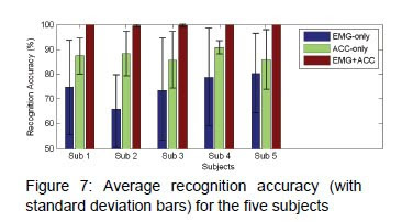
There were only 5 subjects for this test and there were two different tests in order to calculate the accuracy of the systems. Their first test was created in order to just test the system's recognition of each hand gestures. The second test dealt with a Virtual Rubik's Cube puzzle that they had created. Each test had three different conditions. The first condition was conducted with just EMG sensors, the second condition was just ACC sensors, and the third condition combined the two sensors. Each participant practiced the gestures ten times each for each test and they found that the average recognition accuracies for the 18 gestures is shown in the graph below.

The results with the combination of EMG and ACC ended up with a 91.7% accuracy. The EMG sensors which are the ones on the participants wrists didn't do as well as the ACC sensors which were located on the persons' head.

Discussion:
I thought this was pretty interesting because there could be great virtual games that could come from this. It would be a lot of fun to be able to play around with this technology and I know that Nintendo's Wii already has a movement recognition system with their controllers and I think that is why the Wii has so much success. For future work they mentioned wanting to make this more robust and I think that may help the accuracy a little bit more. I think with further research on this they will end up with something that will be really good for the gaming industry.

Tuesday, March 2, 2010

Emotional Design


Book: Emotional Design by Donald A. Norman

Comments: Eric

Summary:


For this book I couldn't really pinpoint whether I liked it better than the first one. I felt that he hit a majority of the same topics, but instead of bashing design like in the first book he was actually promoting the designs of products in this one. It was all about emotion and how someone feels when using a product. He mentions that there are a lot of items that may not have a function, but because they look cool and are pleasing to people that it will still get bought and used in some way. I think the key points he mentions are the three different levels of the brain.
  1. Visceral: the automatic, prewired layer which is the most basic of the levels - How stimulated we are with the object.
  2. Behavioral: controls everyday behavior and learned behaviors - How we interact with an item.
  3. Reflective: the contemplative portion of the brain - Why we like something.
It felt as though the book ranted on about these different levels and how our emotions make us want to use a product versus not wanting to use a product. If it was aesthetically pleasing then people were most likely going to use it, but if it was "ugly" or not pleasing then people would not use it even if it worked perfectly. The design of products should make us happy so that we will want to buy and use them is the basic theme of this book. Then the last few chapters he seems to put a spin on how robots are our future and kind of goes crazy.

Discussion:
Again I really wasn't sure what I thought about this book. I feel that we knew a lot about this already and that yes if I am pleased with the way something looks I am more than likely going to use it. I guess I could relate this to certain websites or communities. If I don't like the way the website looks I am more than likely not going to use it. Same goes with products for my home. If I am not pleased with the way something looks then I do not want it in my house. The future also will probably consist of a lot of the robot things that Norman talks about, and to be honest a few them have already been built and in use today. I think that much of our world is going to become almost completely digital and we're not going to have to work very hard. As long as we all don't turn into those people from Wall-E I think we will be ok.